Less is more: the value of aesthetic essentiality in the Italian and European landscape
We have the enormous privilege of living in Europe, the cradle of civilization, and the source of culture and traditions that have set the standard all over the world. Our country was the protagonist of the Renaissance, an era of change in which a new way of conceiving the world and oneself in it matured, where nothing would have been the same as before in the arts, in architecture, in society, where man began to determine and cultivate his own talents with which he could win the challenges of life by mastering nature and living spaces. Every day, we walk on an impressive historical architectural heritage, from which we can draw continuous insights, observing its historical phases, and studying its evolution and trends. For our company, which deals with urban rehabilitation among other things, carefully analyzing what surrounds us is a continuous source of reflection. Each landscape is a frame that shows before us the environment we observe: it is always different, as it is conditioned by perspective, by our subjective point of view, by spatial geolocation.
The human eye, like a camera, captures in an instant the light, the colors of three-dimensional landscapes that strike it, where nature joins and, in some cases, integrates cities and monuments. It frames the best photo, hanging it among the most pleasant memories of our mind. And it is precisely when the eye is not disturbed, but rather gratified and accompanied in a homogeneous and harmonious image that the memory is fixed in the mind, like a memorable and unforgettable landscape.
The philosophy of "Less is More" in the offer Giulio Barbieri
It is precisely from these considerations that the philosophy "Less is More" was born, the iconic concept of the master Mies van der Rohe, in which we find the essence of Giulio Barbieri's products. Essential traits and minimalist design are our key principles: in the design of outdoor accessories, we prefer rationality and functionality, following the desire to create an order, a measure, a modulation that makes architectural forms clearly perceptible and consistent with each other. This allows us to focus on product development in terms of innovation, as well as make judicious choices about the best materials and construction technologies, in order to offer our customers unique prerogatives and ease of use.
This principle summarizes the concept that the best result, the "more", is obtained by adding as little as possible ("less") to the essence of things. It is a formal minimalism achieved through an accurate work of subtraction. The interpretation we would like to give to the overall work is to consider the three-dimensional development of a product as a musical score, where the void pentagram without notes is basically the melody, the void substantiates the full, the music is represented by the empty spaces between one note and another. Empty spaces must be managed, felt, and measured, and represent the only real variation when a musical text is reproduced. A great pianist will be unique and unsurpassable if he will be able to interpret and manage empty spaces; notes allow limited variations.
Simplifying music, as architecture and other artistic expressions of man, highlights the difference between what is imperceptible and what is invisible.
“Construction does not only define the form, but is the form itself. Wherever true construction proves true content, there are genuine works; genuine works corresponding to their essence. And these are necessary. They are necessary in themselves and as parts of a genuine order.”
Cit. Ludwig Mies van der Rohe
The soul of architectural construction, in fact, can emerge and be exalted only thanks to elements marked by rigor, efficiency, and coherence with the environment that surrounds it. The construction thus becomes a necessity: the simple aesthetics allows us to obtain a functional and essential product, adding innovative pluses that simplify daily use for customers, without destroying the visual balance with nature.
In the philosophy of Less is More, the quasi absence of elements is clear, where the superfluous is subtracted, leaving only space for what is necessary: the materials are the protagonists. Chosen with extreme care, the materials of pergolas and gazebos have a decorative, as well as a structural function: the colors, the finishing of the supporting structure, and the complementary and decorative accessories can be chosen to adapt to the style of the environment in which they are to be inserted, with the guarantee of relying on a quality and long-lasting product.
Minimal does not mean simple: the real challenge is to recognize the superfluous
Let's remember that minimalism does not mean simplicity: the German architect Ludwig Mies van der Rohe, one of the masters of the modernist movement, who made minimalism the main pillar of his work, exalts the refinement of constructive details and the order of structures as elements of architectural works, able to exalt nature and territory.
Architecture and design thus become a frame that underlines the thousands of nuances of the landscapes, those fascinating stratifications that years of history have left us: it is a great revolution that overturns the belief that splendor and complexity make great works.
This means that it is not the landscapes that adapt to the buildings and structures, but it is the design that bows to the majesty of nature: the thought is based on the search for perfection, which is achieved by learning to subtract what is not necessary.
In order to develop design objects capable of exalting the beauty of the environment, it is necessary to have a great competence in knowing not so much what to add, but what to take away: years of study and planning have allowed us to understand what the superfluous is in the field of outdoor furnishings, and how to subtract it in order to create structures capable of celebrating the panorama and enhancing the landscape in the eyes of those who look at it.
The surge in the complexity of everyday life, the quantity of the built environment, and the ubiquity of technology create disorientation; our primary objective is, therefore, to create architectural structures that blend perfectly with their surroundings, without brutally impacting the authenticity of the landscape or urban settings.
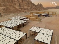
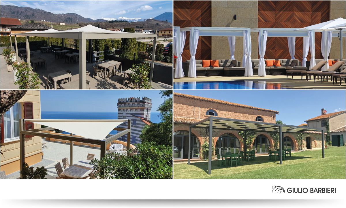
Giulio Barbieri's Outdoor is designed to create an evocative effect of aesthetic coherence, where colors and materials of pergolas and gazebos meet colors and textures of the environment where they are inserted, without causing contrast, but instead shaping themselves into a harmonious whole.
Nature, in this context, is not just an ornament but the answer to a need for mental and physical refreshment: a refreshment that you can enjoy twice as much in the shade of one of our shading systems.

